Voyager: An epic journey for UX&D

Josephine Lie
Design Trainee
Hello my name is Josephine and I am a design trainee with (User Experience and Design).
How do you make a graphic of something as big as our and how do you make it work on desktops and tablets and all the way down to the tiny screens of older mobile phones?
Recently I aimed to answer the above questions when I worked with the team on a project to visualise the journey of .
Check it out on .
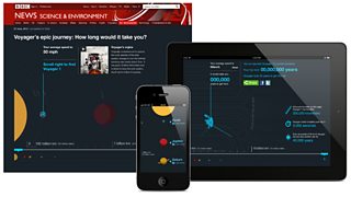
Voyager infographic and calculator on different screens
I helped create an interactive infographic that depicts Voyager’s journey through our Solar System and a calculator feature that allows users to compare their commute time with Voyager’s journey. The feature also provides information about the celestial objects and different points of interest Voyager encountered along its path.
The challenge of this piece of work lay in designing a responsive treatment for a complex set of information and Voyager offered us a fantastic opportunity to dive head first into a longer-term project that would explore responsive-design thinking in depth.
Like many projects Voyager was a collaborative effort. I worked closely with journalists John Walton and Christi Sodano, UX developers Tom Maslen and Steven Connor as well as editorial designer .
We began by addressing how to make the piece personally relevant to the user. After discussions it was decided that an engaging strategy would be to allow a user to compare something personal, such as their daily commute, with Voyager’s path. A user could have their commute details contrasted with the Voyager’s journey through the Solar System.
For example, if a user has a five kilometre commute to work over 30 minutes the personal calculator would show that it would take them an astonishing 171,977 years at 10km per hour to travel to where Voyager is now and yet Voyager could have completed the user’s commute in a mere 0.26 seconds. Just a snapshot of how far and fast Voyager is speeding along!
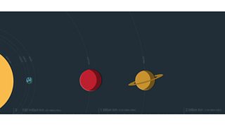
Detail from the long graphic
As well as the calculator we designed a long space graphic to illustrate Voyager’s route past various celestial objects. This was the longest file I have ever attempted – stretching to 10,331 pixels. The illustrative style adopted for Voyager was that of simple clean graphics that sat boldly against a colour palette of dark ‘space’.
The highest priority was given to maintaining a clear visual hierarchy so that the user could interact with the information panels and easily navigate through the piece.
This illustrative approach included visual subtleties such as the planetary shadows and animations that illuminated selected objects (on the desktop version only). Creating a completely solid colour background for the entire page formed the immersive backdrop appropriate to the space theme.
Close collaboration with developers during the responsive design process allowed us to negotiate the feasibility of the design as it was adapted across various sized screens.
Designing responsively forced us to prioritise components so we could then cater for users on basic feature phones and progressively enhance the user-experience on smart phones, tablets and desktop screens depending on device capabilities.
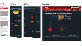
Views on different screen sizes
In other words, we needed to specify WHAT the message was and HOW it could be expressed on different devices.
In this case that meant adapting the calculator to match different device capabilities. For instance, feature phone users received their static calculated results at the top of the infographic, while users with newer smart phone models were able to experience the calculator dynamically, adjusting its calculation based upon their location in the long infographic.
From the perspective of a design trainee this exercise was invaluable. It hopefully means that future design processes will follow this route and ensure that the visual design stays grounded around the overall message.
Another responsive solution included altering the vertical scrolling action on mobile so it displays as a horizontal scroll on desktop to take advantage of the increased screen real-estate.
In a similar way, the touch screen interactions possible on smart phones meant that information panels could be revealed through the touch action on certain visual items. This prevented the information panels from cluttering the limited screen space.
By contrast, users on desktop will notice that as they scroll through the infographic the information panel remains stationary on the page while its content changes. This was again a decision to provide appropriate information as determined by the device’s capabilities.

Text and graphic detail
Specifically for mobile, the delivery of the long vertical graphic meant designing to a minimum dimension of 320 pixels wide to accommodate the narrowest mobile screens and ensuring that graphic items remained centrally aligned as the mobile screen sizes expanded to 640 pixels.
These decisions were based on striking the right visual balance for the right screen and the ease in which these solutions could be implemented.
Throughout the design process user-testing played a significant role, in this case ‘’ where we approached individuals around �������� New Broadcasting House to see how they would interact with prototypes for both mobile and desktop.
As user-testing was carried out at different stages of the design process it focused on specific issues as they emerged. User-testing was therefore a valuable source of feedback which was often taken into consideration when refining the design.
The opportunity to assist the Visual Journalism team in tackling this interactive infographic has been a great way to explore the challenges of responsive design, the value of user-testing, and the advantages of collaboration between designers, developers and journalists alike. Thank you to the team and all who contributed.
I hope you’ve had a chance to explore the Voyager infographic and it would be great to hear what you think.
is a design trainee in �������� UX&D and you can try it out yourself on .