New �������� iPlayer: redesign insights

Kutlu Canlioglu
Creative Director
Hi, I’m Kutlu Canlıoglu, Creative Director for TV&iPlayer.
Over the last year we’ve been redesigning �������� iPlayer across all platforms. And on Tuesday of last week a public preview of the and was released. I wanted to share some of the thinking that went into the redesign.
Our goal was to create an improved and more coherent user experience across the different applications that deliver the �������� iPlayer service. As part of the redesign, we’re replacing three different websites we’ve been maintaining for mobiles, tablet devices and desktop computers with a single responsive website. We’re also rolling out a new TV app for connected TVs and consoles that support HTML, which will eventually replace the two different apps we currently support on TVs. And over the coming months, our native apps for mobile and tablet devices will be adopting the new UI framework, patterns and functionality inline with our new responsive website and TV app.
We had four key principles to help shape the design of the user experience across the platforms:
1. Simplify finding
2. Encourage discovery
3. Pave the way to a more personal iPlayer
4. Never a dead-end
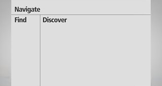
Find/Discover
Finding something particular and discovering new programmes are the two main user activities on iPlayer.
We know from stats on our current desktop site that 58% of our users come to iPlayer with something particular in mind to watch. This ratio is even higher on mobile devices.
But there are around 1,200 hours of content available on �������� iPlayer at any one time, and this will increase as we extend the availability window from 7 days to 30 days (subject to approval from �������� Trust). So exposing the breadth of content available, without getting in the way of those users who have come with something specific in mind, was a key consideration.
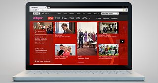
Our approach to consistent use of the screen across different platforms for user needs
To achieve this on the new responsive website, we used the familiar carousel pattern to facilitate discovery, and supplemented it with a set of tools we refer to as the “find tools”.
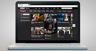
The screen framework in use on the home page layout on computers
The find tools get you directly to what you’re looking for, but they minimise if you engage with the featured content in other parts of the page. Similarly, if you use the find tools, the featured content dims down to get out of your way.
On devices with smaller screens, we use a vertical scroll to support finding and discovery, with the find tools at the top of the screen to help get you straight to the programme you’re looking for if you already have one in mind.
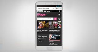
The screen framework is adapted to better fit the key user needs on mobile devices
On our TV app, we use a similar framework to the desktop experience. The find tools are on the left, and if you’re here to browse the programmes, you can move horizontally to browse the best of and (previously) hidden gems on iPlayer.
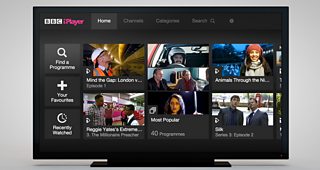
iPlayer home screen on a connected TV app with a similar framework to a desktop computer
In the coming months, we’ll be integrating the new TV app into the Connected Red Button service. And we’ve been working closely with colleagues across the �������� to make sure there’s a joined up experience across the range of �������� TV apps.
Our aim is that once someone is using iPlayer on one device, they’ll be familiar with all instances of iPlayer across all their devices.
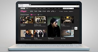
Discovery through Channels and Categories
Curated content from the ��������’s TV channels is a new feature we’re introducing as part of the redesign. Previously, the presence of channels in iPlayer was limited to browsing by the broadcast schedule. The new channel pages, with their strong branding, provide a destination where our editorial teams can showcase programmes from each channel, and surface content that is made available exclusively for iPlayer, or premiered on iPlayer first.
�������� ONE page on the new �������� iPlayer
They are also home to each channel’s live TV stream. Of course, we continue to offer the full schedule through our TV Guide, as well as channel-specific schedule pages.
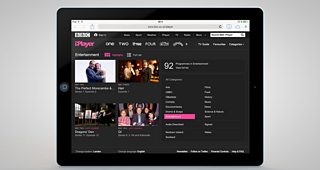
Categories is another area where we’re making it easier to discover new content. We continue to offer the list view of everything in each category but you’ll also find a curated view of programmes you might not have known about.
Categories in the new iPlayer are a key part of the discovery experience
��
A more personal iPlayer
Helping users personalise iPlayer was a key goal of the redesign. You’ll find that favourites work similarly to how they work currently but with the bonus of a responsive approach: now, if you sign in to the site you’ll be able to get your favourites on your mobile and tablet devices as well. We’re also working hard to integrate signing in into our native mobile, tablet and TV apps so we can offer a seamless experience across the platforms.
We’ve also made “Recently Watched” easier to find. It gets a much more prominent place on both the responsive site and the TV app and provides a “warm trail” into programmes. We think of this as a form of “lazy favouriting”, and are working to improve this further so we can also use this space to surface new episodes of the things you’ve watched in the past.
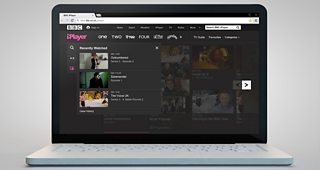
The new �������� iPlayer home page with the Recently Watched area open showing three programmes
The redesign also paves the way for the future development of a much more personal iPlayer. So, for example, we’ve recently prototyped incorporating personalised recommendations based on programmes you’ve watched and your favourites into the browsing experience.
Never a dead-end
When approaching the playback page, we had to keep in mind the fact that user needs change throughout the watching experience.
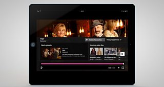
Since a majority of our users currently use iPlayer to catch-up with the latest episodes of programmes they follow, most journeys in the new iPlayer are biased towards getting users to the latest episode as quickly as possible. So the first user need on the playback page is to establish that this is the right episode, and if not, to get you to the episode you’re looking for. To aid this we list all available episodes directly below the programme information of the episode you’re on.
Similarly on TV, when the programme starts playing, the playback controls are briefly displayed in their expanded state, exposing the long description of the episode, to help you make sure you’re on the correct episode. And, if you’re not, you can access all other episodes to the left of the programme information.����
��
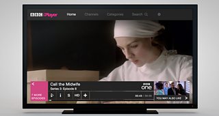
Playback controls on the connected TV app include an easy way to get to other episodes
During playback the UI dims down if you’re watching embedded on a web page, or disappears completely in full-screen mode. On the TV app, you can still browse iPlayer while the programme you’re watching continues playing in the background – an experience users will be familiar with from our red button service.
At the end of the programme, we display the next episode if it’s already available, and give you recommendations for other relevant programmes.
The More Programmes panels open automatically at the end of playback
Similarly, while you’re browsing a category, if you haven’t found anything that takes your fancy, we give you a link to the full listing of that category, as well as links to other categories if you want to skip to another genre.
��
End of the Highlights category on the new iPlayer with onward journeys
And if you’ve searched for something and it’s no longer available on �������� iPlayer, we’ll give you a link to the programme website so you can find out if it’s coming back on air and to iPlayer.
Redesigning for new and existing users
An important part of any major redesign is getting it right for new and existing users.
For example, we knew that to provide a simpler interface that makes iPlayer as inclusive as possible for new users, we might need to move some of the features that existing users enjoy to a different part of the interface.
To get this right we have repeatedly user tested each change. And we’ve been pleased to see that existing users find them intuitive. We think this is for a few reasons: we’ve made sure users can still find what they’re looking for using routes they’re familiar with on the current iPlayer; we reused design patterns that are familiar from other parts of bbc.co.uk; and we’ve ensured that changes to the key part of the iPlayer experience, the new playback page, are straightforward and evolve from the current design.
Finally, one thing we haven’t changed. Users who’ve come to enjoy that little bit extra from iPlayer (and Spinal Tap fans) will be happy to see that, where operating systems allow, the new iPlayer’s volume controls still go up all the way to 11.
Redesigning �������� iPlayer has been a great experience. And I hope we’ve gone some way towards living up to the responsibility that comes with working on a service that’s enjoyed by so many people. You’ll see this is by no means an end but very much a starting point for iPlayer to evolve further in future.
I look forward to hearing what you think. You can use , or post your comments to this post and I’ll do my very best to respond to you.
Thank you for reading.
Kutlu Canlıoglu, is Creative Director for TV&iPlayer, �������� Future Media