Expanding the ��������'s Global Experience Language

Andrew Greenham
GEL Creative Director
Tagged with:
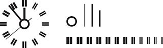
The lines of the �������� clock inspire some of GEL's iconography
I'm Andrew Greenham, Creative Director for the �������� Global Experience Language (GEL) and part of the User Experience and Design team for �������� Future Media.
In this post I'd like to talk about some of the additions to the �������� Global Experience Language and give an overview of the new �������� design guidelines and patterns for Mobile, IPTV and Tablet devices. You can see the recently updated GEL site at .
In February 2010 �������� UX&D Head of Design gave an insight into the process of developing the new Global Experience Language, or Global Visual Language 3.0 (GVL) as it was known back then.
The rollout has continued over the past year and a half and has included the launch of �������� Proms, Desert Island Discs and at the end of last year.
Following the initial design phase, Bronwyn and Creative Director Ben Gammon worked with Research Studios and the wider �������� UX&D team to deliver the new Global Experience Language.
In June 2010 the GEL rollout began with the initial launches across , Food and sites, to name just a few.
The rollout continued through 2011 and included the launch of �������� Proms, Desert Island Discs and the new.
The GEL website: a reference point for designers
Alongside the initial 2010 launch, a also went live showcasing the new styleguide and design patterns library as a resource for designers working on �������� services.
Our early GEL guidelines and patterns were very web-centric. Over the past eighteen months we've been working to expand the guidelines for other platforms and at the end of last year an updated edition of the GEL website went live; this now includes guidelines and patterns for , and devices and also includes a .
As with the original GEL web styleguide, the framework for the guidelines on each platform is based around a set of Foundations, Building Blocks and Design Patterns. Where there is specific and fundamental knowledge essential to effective design on a particular platform or device, we've also introduced a 'Design Considerations' section. This section serves as a best practice introduction for designers new to working across, what may be for some, previously unfamiliar platforms.
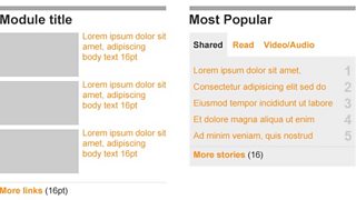
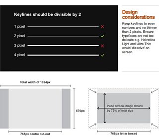
The 'Foundations' section for each platform includes information on the underlying universal grid; this is scaled to reflect the various device resolutions and a canvas on which a series of flexible layouts can be created. It also includes global elements such as the toolbar, local masthead and footer; elements that can downloaded from the GEL site as Photoshop or Illustrator templates.
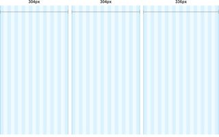
The Universal Grid for desktop web showing a three-column page template overlaid (at 50% actual size). The wider 336px column supports the standard advertising formats.
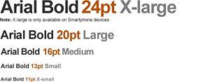
The 'Building Blocks' section includes the page elements such as typography, iconography and information on using images. We've also included examples of typographic formatting and module layout.
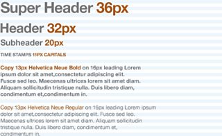
An example of the GEL typographic format showing suggested type size hierarchy (actual pixel size)
GEL for Mobile
The GEL guidelines for mobile followed soon after those for the web. Using the desktop web guidelines as a starting point Ux Designer Stephen Robertson developed a styleguide and . Adapting GEL for the smaller screen sizes, this covered both featurephone and smartphone and was considerate of .
The naturally needs to work at a smaller resolution, but like its desktop web counterpart, provides a framework for maintaining consistent padding values and aligning content modules and text.
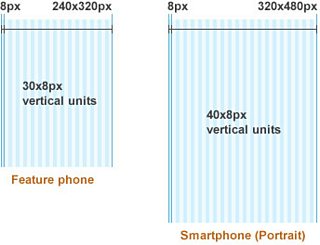
The Mobile Universal Grid for Featurephone and Smartphone screen sizes (at 50% of actual size)
This grid also needed to reflect device orientation and includes both landscape and portrait formats.
On Mobile, where possible, we've tried to that maintains the same bold typography and contrast of type sizes, however technical limitations on some devices means that it is not always possible to support this format in its purest form. In some cases where Arial is not available, device specific fonts will be used in its place.
GEL Mobile Typography (actual pixel size)
We've also included downloadable psd templates that provide a starting point for some of the common mobile content modules.
Templates for two common mobile content modules
GEL for IPTV
Developing effective guidelines for offered up many challenges. The key to adapting GEL for TV was to get a clear understanding of platform limitations and provide designers with the fundamental principles for designing for television. For example, includes guidance on TV specific display issues such as flicker, bloom, colour contrast and alignment to screen safe areas.
How to avoid flicker on a TV interface (top) and Designing for different aspect ratios
Where possible we wanted to reflect the bold styling we have on the web, mobile and tablet. Getting the GEL typography right is all about applying a confident hierarchy and creating dramatic contrast between the headers, sub headers and body copy. Due to the legibility challenges on TV we have a much larger minimum font size, so headers are larger still to maintain the desired contrast.
As with mobile devices, even the most modern IPTVs and set top boxes can be limited in the fonts they can support, but again where possible we recommend using Arial or Helvetica Neue.
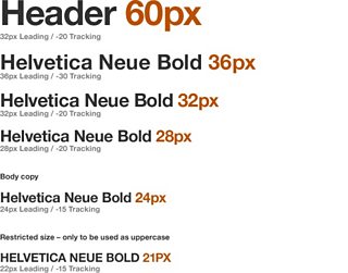
GEL Connected TV Typography
In addition to the traditional and essential TV Safe Areas we've also introduced to help maintain consistent padding and alignment of elements.
One of the biggest challenges in adapting GEL for TV platforms was in the application of colour. In GEL for web, the use of colour was deliberately flat; background images may include rich imagery and gradients, but in core user interface components we've deliberately avoided the use of gradients and drop shadows. This creates a more contemporary feel that is both sharp and clean. In early GEL concepts for TV interfaces a direct translation of this philosophy left the UI feeling too stark and in danger of looking clunky. This is exaggerated by the fact that on TV the user interface is presented at a much larger size.
Naturally the audience has come to expect a more 'televisual' treatment of graphical elements on IPTV platforms that leans more towards a suggestion of 3-Dimensional space. With this in mind we've adapted GEL specifically for TV and introduced guidelines that specify . Used sparingly these can help prioritise information by creating a sense of depth on TV.
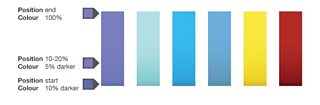
Creating colour gradients: GEL includes very specific guidelines for creating subtle gradients and drop shadow for the television UI
It's important to note that limited support for extensive colour palettes on some IPTV platforms can mean that effective gradients are difficult to achieve.
GEL for Tablet
Up until recently GEL didn't extend to include any . With an increasing number of �������� services being developed on this emerging platform, Senior UX Designer Simon Rooney set about creating an initial set of guidelines that provides a foundation for further design development.
As with the other three platforms there were also some ; for example, one of the key points to consider is that tablet devices are unique in that the context in which they are used can change considerably. With this in mind we needed to write guidelines that reflected both orientation and reading distance (close, medium and far). Naturally this meant providing flexibility around font sizes and considering how the grid would adapt at a range of resolutions.
As with a number of smartphones, the lack of hover state on touchscreen devices also meant . GEL guidelines for desktop specifies an underline for links on hover; on tablet we specify a combination of bold type and colour to differentiate links from body copy and signify a clear action state on interaction by changing the link colour when tapped. We felt that the colour change felt cleaner than using underlines for specifying links or the action state.
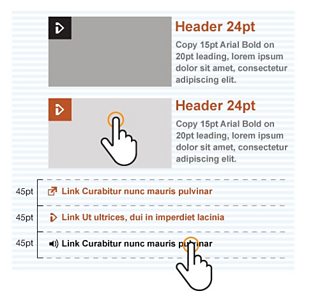
On tablets, a combination of bold type and colour differentiate links from body copy
In addition to establishing best practice and tapping into some of the unique features of the tablet platform, we also wanted to give designers and a guide to best practice.
The Design Patterns
With the Foundation and Building Blocks as a starting point for each platform, the GEL Design Patterns provide more specific detail around common pan-product design components.
When developing the patterns it was crucial that we adapted each accordingly rather than trying to shoe-horn an interaction pattern developed for one platform on to another for the sake of consistency. It was crucial to play to the strengths of each platform and be considerate of the things like the control device for each platform (Mouse, Remote control/D-pad or Touch).
The Accordion is just one example of how design patterns have been adapted across the platforms. Initially this was developed as a web design pattern:
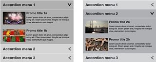
Accordian Menu (desktop) with different elements expanded
Then adapted for the smaller screen size on mobile…
Accordian Menu (mobile) in collapsed and expanded state
…and finally modified to be considerate of the remote control input and introduction of selection highlight used for IPTV:
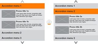
Accordian Menu (IPTV) with two different elements expanded
A new global toolbar
We've recently designed and launched a . This is currently being rolled out across both bbc.co.uk desktop and mobile sites.
The objective of this redesign was to make the toolbar work harder to expose the breadth of �������� content. In addition to making the global links more prominent to increase visibility, we've also provided the ability to promote upcoming events such as London 2012 in the toolbar.
On desktop the previous version of the toolbar didn't offer a great deal of flexibility in terms of integration with banner graphics and we were keen to offer a variant that could be blended more effectively with the visual treatment of the wide variety of �������� sites. This led us to design a wider variety of toolbar variants with a greater range of background translucency. We offer transparent light (20% black), medium (40% black) and dark (70% black) in addition to opaque white, black and grey variants.
White and transparent versions of the toolbar
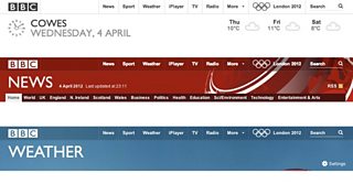
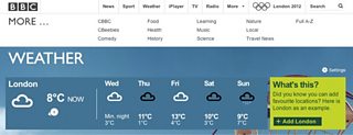
For example the transparent light variant of the toolbar on the blends nicely with the various weather ambient background images when overlaid. The default white version of the toolbar is used across the core �������� sites such as the and .
On the very latest version of the new toolbar that sits across more recent GEL sites, we've also introduced a new treatment for the 'more' panel; this serves as an index to other �������� sites. This is implemented as a pushdown panel on opening; the rationale behind transitioning the toolbar to white when selecting the 'more' link or search field was to signify that the toolbar is entering a global mode and therefore references the white variant seen on the ��������page and Search pages.
The toolbar turns white when 'more' or 'search' are selected
The of the toolbar can be seen on the new mobile homepage, �������� Sport Olympics and �������� News sites. Due to the reduced width, the global links have been collapsed into a Menu pushdown panel that echoes the functionality of the desktop version.
A new set of GEL icons
With the aim of making GEL even more distinctive we worked with the design agency RGA to update the original set of GEL icons. Whilst keeping the bold and simple style of the original set we've modified the icons to make them more "ownable" and also to meet the requirements of new product features.
The is a strong �������� "signature" element and we used this as inspiration for the visual style; where applicable basing stroke width and angle of line upon those found within the clock face.

The �������� Clock, the strokes that make it up, and (top right) the application of the visual language in icons
The design of the each icon involved exploring a number of potential options
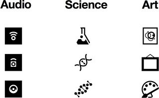
While it was important to adhere to the aforementioned visual design principles, we were careful not to deviate from established iconography that was instantly familiar to the user. The audio icon was a good example of this; initial concepts explored a new approach to representing audio but we ultimately reverted to the more traditional right facing speaker icon with some subtle updates to the visual styling.
The need to design for universal appeal also played a part in the design of the Science category icon; while we loved the intricacy of the DNA strand, we opted for the beaker as it was more easily recognized and had a stronger association with the subject.
The design process also involved two rounds of user testing to validate the new icons both as stand-alone artwork and more importantly in the context of the web page.
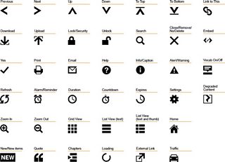
A sample of the updated GEL icon set
For more on the new GEL icons you can (PDF) and other assets from the of the GEL website.
More GEL to come…
GEL has always been about encouraging designers to build upon the guidelines and to develop new design patterns. With that in mind, GEL is still evolving, we're working to make the design language more distinctive whilst at the same time, continuing to take on board the requirements of new �������� products.
We're already expanding upon these new cross platform guidelines; and the use responsive design and build upon the GEL mobile, tablet and desktop guidelines by treating them as a continuum.
My colleague Ste Everington will blog about the ��������'s new TV channel homepages soon.
For more information go to .
Andrew Greenham is Creative Director for the �������� Global Experience Language (GEL) and part of the User Experience and Design team for �������� Future Media.