Sport Responsive Correspondent Pages

William Bamford
Software Developer
Hi, I'm Will Bamford, a software engineer within �������� Sport.
In this post I want to talk about the release of our new correspondent pages. These pages are the first within Sport to fully embrace (RWD) - that is, the pages adapt to the device they are presented on whether that is a mobile, tablet, desktop or anything else inbetween.
We believe this is something of a milestone for Sport as these are our first "fully responsive" pages. More on this later, but first let's highlight an example -
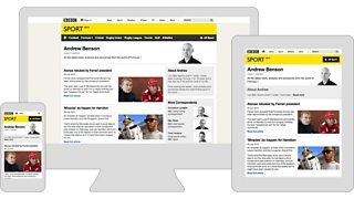
Andrew Benson's correspondent page on different screens
These pages serve as landing pages for our correspondents, surfacing their most recent correspondent pieces (in-depth analysis into their own sporting areas of expertise), together with a short correspondent bio and links to the other correspondents within �������� Sport.
Users of the current desktop offering of these pages may not notice many changes, as they look quite similar to the pages they have replaced. However, if you look under the hood things are very different and in many ways, the journey towards building these pages is more interesting than the destination…
When I first joined the �������� up in Salford almost two years ago I was part of a small team tasked with developing the mobile Olympics 2012 website. Back then, RWD as a technique was gaining popularity with web development community but we had yet to see widescale adoption on websites with significant traffic. We applied some responsive techniques to the Olympics 2012 site, but for various complex reasons the pragmatic approach at the time was to deliver three variants of the site: one for low-end mobile devices ("feature phones"), another for smartphones and a completely separate desktop site. The server decided which "box" your device would best fit and served the most appropriate version of the site.
Whilst we were really pleased with the outcome and the reception was , this resulted in duplication of effort in many areas from design and development, through to testing and maintenance. Additionally, it was a solution that didn't scale in the emerging mobile landscape in which the boundaries between devices was beginning to blur.
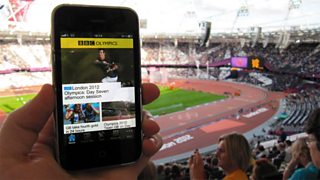
�������� Sport Olympics app
After the London 2012 Olympics, most of the mobile team moved on to developing the new . We were determined to follow at �������� News and use this as an opportunity to
This was a approach in two senses:
1.We adopted many of the principles of RWD and applied this to the new mobile site. This has formed the foundation which is allowing us to scale up to larger screens without disrupting the existing desktop web experience. We have been aided in this by sharing knowledge and code with other �������� products such as News.
2.We used this as an opportunity to address our content strategy. The constraints inherent to mobile (screen size, input, connection speed) force you into prioritising what is / isn't important to the user and then focussing on delivering the former. We are using analytics coupled with heat map visualisations, as well as editorial input, to ensure that we deliver a streamlined experience through our fully responsive pages.
For us, mobile first doesn't mean desktop browsers gets left behind. Far from it - the reason we have taken our time applying responsive web design to larger screens is because we want to get it right. We are working hard to address some of the unwanted "signatures" of RWD such as the tendency to produce rigid grid-like designs, the constraints this can place on content order / layout, and the visual flashing / reflow that's often associated with enhancing the page after the initial load (a strategy which is sometimes necessary to keep page weight to a minimum). In addition, we have put in a great deal of effort into ensuring we can deliver our responsive pages to older desktop browsers, such as IE 7 and 8, that do not support some of the core functionality that is often a prerequisite for RWD (e.g. ).
We now feel like we are in a great position to build future responsive web pages for Sport, working towards serving all users from a single URL. At which point we can stop talking about "responsive" web pages, and instead go back to talking about web pages...
William Bamford is a senior software enginer in �������� Sport