
Hello,
Six months ago I blogged about - Sport's first fully responsive web pages. Since then we have been working hard creating a whole range of Winter Olympics pages such as the , e.g. , the and .

The Sochi 2014 homepage across devices
In this blog post I want to go into a bit of technical detail on how we built these pages and how this applies to future responsive content. You may also be interested in reading Johnathan Ishmael'swhich details how our colleagues built pages supporting live text commentary and live video and audio for Sochi.
A race against time
Working to strict deadlines is a challenge that every developer on Sport quickly learns to deal with - we cannot move events in the sporting calendar, so we have to plan carefully and manage our time effectively. Given that we have three major events this year: the Winter Olympics, FIFA World Cup and the Commonwealth Games, much of the development work put into Sochi has been in developing a framework that will make building other Sport pages not only easier but achievable given the time constraints.
The best developers are lazy (bear with me) - wherever possible we want to avoid writing new code. Moving towards fully responsive web-pages and semantically structuring our information around type (e.g. today's stories, audio and video highlights, long-form articles), rather than platforms (desktop vs. tablet vs. mobile), goes a long way towards removing duplication of effort. In addition to this, in collaboration with other �������� product teams such as News, we have come up with an approach that allows for maximum re-use of anything new that we develop…
The recipe for a page
To construct a page, we need three things: components, a page template which gives these components structure within the page layout and the layout configuration which configures each component within the page.
Component
A component is a self-contained building block - each page is composed of a number of these. To aid re-usability each component is decoupled from other components - there are no cross-dependencies but we can use a JavaScript mechanism to communicate across components on the client-side if necessary. The component itself is responsible for fetching data from services, processing this (filtering / ordering / adapting data) before rendering itself - usually as a block of HTML. Decomposing the content into components not only facilitates effortless re-use but it also provides us with a common vocabulary about which we can describe different page between team members (e.g. UX&D, editorial, development and product).
The composition of the Sochi 2014 homepage is illustrated below. Each coloured section marks a different component:
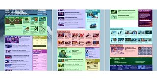
The homepage is quite long, so here it is split into 3 sections (top/middle/bottom).
Multiple instances of the same component can be displayed on the page in different locations, as demonstrated by the components labelled "Audio Video 1" and "Audio Video 2" above.
Each component has an associated set of CSS (we have found that using the is a natural fit here) and may have an associated JavaScript module which adds behaviour. Components adapt to the space in which they are contained by fluidly resizing and changing their internal layout where necessary. Components can either be "baked in" to the initial page's HTML response, or post-loaded with Ajax.
Page Template
A page template defines the overall structure of the page. It provides slots into which components can be placed. For example, the following shows a simplified version of the event index page template which is used to power the :
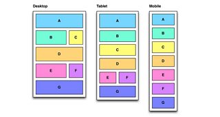
The event index page template. It has seven slots labelled A-G
The "event index" page template knows how to structure components, but it is not tied to the Winter Olympics. The layout itself adapts according to the space available - in the example above, the layout changes from multiple columns at a wide viewport (e.g. typical desktop screen size) to a more vertically stacked layout as it is constrained towards narrower screens. We use a responsive "grid" specified by theteam to ensure internal spatial consistency on the page and with other �������� products.
Multiple components can share the same slot. For example, the "medal table" and "event schedule" shown��above are both placed in slot C.
Layout Configuration
In addition to decoupling components from each other, we also make every effort to decouple the components from the content itself. For example, there is nothing in the "headlines" component shown��above that forces it to display Sochi 2014 stories - it has a responsibility to present a list of editorially managed headlines but is not tied to the Winter Olympics.
Layout configuration is the part that provides context - it configures a particular page by defining the following for each component:
•Their slot within the page template (the location in which they are homed);
•The service from which they should fetch their data and the configuration of this service request;
•Hints on how they should display.
Layout configuration is the least re-usable of the three ingredients. Therefore it is important that it is lightweight i.e. concise and easy to create and maintain. For the Sochi 2014 homepage, a sample of the layout configuration as represented by looks something like this (some property names have been changed for clarity):
��
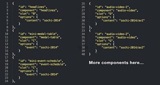
Layout configuration for the Sochi 2014 homepage
The �������� Sport editorial team are able to change the layout of the page by applying overrides to this configuration (by hiding / showing components or changing the location at which they are displayed).
Developing for the long-term
With development cycles that are tied to the Sporting calendar, it can be easy to fall into the trap of setting all of your goals around the next "big" event. However, we do try and find some time to invest in tasks that whilst not meeting immediate, short-term goals, will pay off in the long-term through more efficient development, better automated testing, or a higher-quality product.
The viewporter is one such tool that meets this criteria. It's a very simple in-browser tool for testing web sites at various screen sizes. We created this tool over a few days in collaboration with UX&D earlier last year and have recently open-sourced the code. You can or :
��
The road to Glasgow
Hopefully this blog post has given you some idea of how we build pages within �������� Sport. Over the coming weeks and months we are going to be applying these techniques to both the World Cup 2014 and Commonwealth Games pages.
William Bamford is a Senior Software Engineer in �������� Sport