Please read the Licensing terms before you download this content.
Overview
How it works
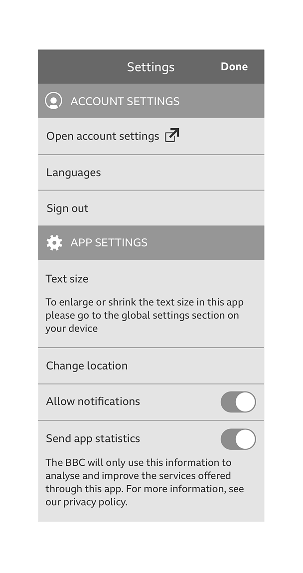
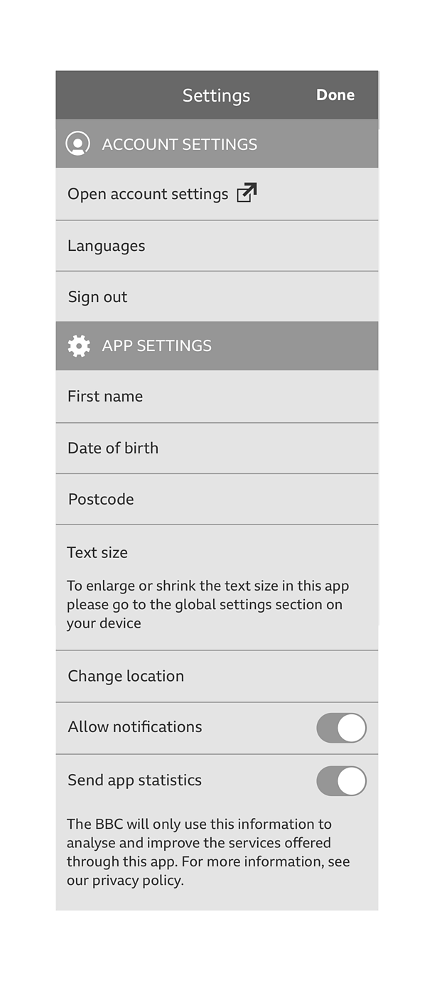
The settings screen is split into two main sections:
- The account settings
- The app settings
If your app uses �������� ID, then you must always include the account module at the top of this screen. Please see account in apps for more information on the account module.
A 'setting' is anything that you can 'set'. The app settings section should include settings that are only specific to your app. What you include in this section and what features are available in your app is largely up to you.
Mandatory settings
Some common settings are mandatory, either for legal reasons or from a good UX point of view. If your app has a feature linked to any of the below, you should be able to control it.
| Setting description | Applicable settings |
|---|---|
| Control over the text size | Text size |
| Control over data and how or when it's downloaded | Restrict data to Wi-Fi only, allow downloads, downloads only, higher quality downloads |
| Allowing us to see your app statistics | Share statistics |
| Control over the parental lock | Parental lock |
| Control over your notifications | Allow notifications, notification sounds |
Setting categories
If you have lots of settings, you may wish to break them up into categories to add some structure to your screen. All your settings should be able to fit into the following categories (headings are in priority order):
Note
If you can't find the setting you require below, then please see the app information guideline. Information such as 'terms of use' and 'privacy' should sit in app information.
| Header | When to use | Example |
|---|---|---|
| Personal | Any personal information not yet captured by account | Age, name |
| General | Any settings general to your app | Text size, change location, compact layout, carousels, widget update frequency, opt into beta, sleep timer/alarm, temperature unit, wind speed, flood alerts, linked music services |
| Notifications | Control over your notifications | Allow notifications, notification sounds |
| Data usage | Control over how data is stored, used and downloaded in your app | Restrict data usage to Wi-Fi, autoplay media, background app refresh, download over Wi-Fi only, allow downloads, allow higher quality downloads, clear search history, sync images for offline use |
| Security and privacy | Settings such as parental lock and share statistics | Parental lock, share statistics |
| Start up screen | Control over how your start up screen appears | Start up screen appearance |
Toggles and checkboxes
A setting can exist in different states. It can either be on or off, or it can offer a multiple choice.
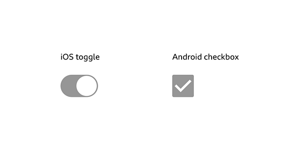
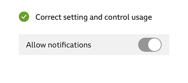
To make your choice easy, you need a control to adjust the setting. If the setting only has two options (e.g. on or off) then use a toggle on iOS and a checkbox on Android.
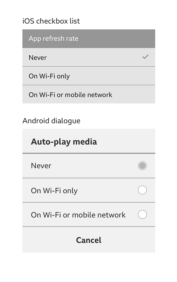
If the setting offers a multiple choice, use checkboxes on iOS and use a dialog box for Android. That box should contain the options in a list, along with radio buttons.
Rules
- GEL recommended font sizes should be used.
- Brand colour should be used on toggles, switches, text boxes and titles.
- A white or black background can be used.
- The headers (account settings and app settings) must be written in capitals on iOS and lowercase (with a captial letter at the start of the word) on Android.
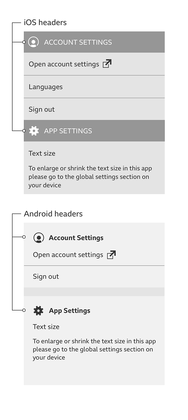
- The setting must always sit on the left, with its related control sitting on the right.
Grouping settings
The settings categories above can be used if you've got a lot of settings and they need breaking up into groups. They can either be used as headings to break up the screen, or as links to a sub-screen (with the relevant settings placed there). The following is recommended:
7 or fewer: Don't group at all.
8 to 15: Group the settings into their categories, using the category name as the heading.

16 and above: Only show the category names. Each name should then be used as a link to a sub-screen. These sub-screens will be home to that category's related settings.

Variations
If you don't have a hidden menu in your app (such as a side drawer menu), and so can't split up settings and app information, you can include the app information in the settings screen.
Pattern in action
This pattern is currently being used by the �������� Bitesize app, the ��������+ app and the �������� Weather app, available here:
/
/
/
Licensing
These assets are available for download on the following licence terms:
You can:
- Download the assets and use them free of charge;
- Use the assets without attribution; and
- Modify or alter the assets and edit them as you like.
You can't:
- Use the assets in a way that would bring the �������� into disrepute;
- Make available the assets so that they can be downloaded by others;
- Sell the assets to other people or package the assets with others that are for sale;
- Take payment from others to access the assets (including putting them behind a paywall);
- Use the assets as part of a service that you are charging money for; or
- Imply association with or endorsement from the �������� by using the assets.
Disclaimer: The assets are offered as is and the �������� is not responsible for anything that happens if you use them.


