Responsive design in data and tables

Christine Charnock
User Experience Designer
Hello, I’m a Junior User Experience Designer working on the �������� Sport site.
Last year��I was asked to design the medals tables for the Sport website. My brief was to create a single table that would work successfully across all screens and devices, as well as be re-usable for the many events��the ����������covers. , and beyond. I’d like to share with you��the process I used in this project.
Looking back at the user research of the 2012 Olympics medal tables, we knew that we needed to streamline the module to make it work responsively and easier to digest all the information. The idea was to create a design that would simplify such a huge amount of information - making the data accessible, easy to read and engaging - without overwhelming people or making them dig too deep.
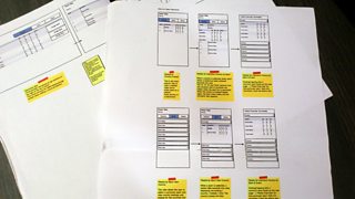
To create such a design, together with my editorial and development colleagues I started jotting down which data would be the most important to include. I then created rough wireframes and sketches firstly on paper, and then onto the screen using Balsamiq Mockups is a piece of software that allows you to create simple, low-fidelity wireframes really quickly using pre made, drag-and-drop elements.
��

Early sketches helped to pin down the most important data to be contained in the table.

Possible features such as filtering were also considered at this stage.
This sketchy approach allowed me to really focus on the structure and user journeys, rather than becoming distracted by the aesthetic. As soon as design software is opened, it’s easy to start making wireframes pixel perfect – it’s the overall structure and usability that matters the most at such an early stage, as a designer you need to resist the urge fall into that trap.
A set of early wireframes created using Balsamiq Mockups
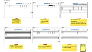
Early wireframes depicting how the desktop sized medal table could appear.
The key was to make the data clean, clear and concise on every device including feature phone devices without Javascript and smaller screen sizes. By starting the design process mobile first, it allowed me to really tackle the challenges of space restriction and to decide on the most important data required to make the medal table useful and coherent. It was also important to ensure that the same data and information would be available to all users - regardless how they would be accessing the medal table.
After an exploration of different patterns and dropping them into a few user testing sessions showing the table to real people, It became clear that a tabbed approach was preferred as it would allow people to easily switch between medals ‘By Country’ or medals ‘By Sport’.
Once I’d established the table structure, I began working with our developers who could now begin building the tables. This was at this time I could start to explore the visual styling. After playing with background highlight colours on every other row, I found that this looked too heavy and actually made the data less easy to read. By using a simple key line between rows, data could be scanned much more easily.
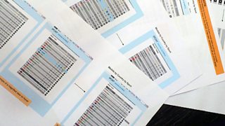
An early exploration included background highlight colours on every other row
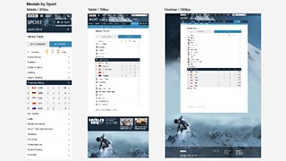
The ‘By Country’ view is the default open tab, displaying a ranking of countries, gold, silver and bronze medal counts, and a total medal count. As well as this basic data, additional information is displayed by selecting the row. A dropdown reveals a breakdown of what sports the country has won medals in. The alternative for a feature phone without Javascript was for the breakdown to appear in a new page.
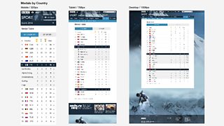
The default view of the medal table is by Country
��
The ‘By Sport’ view shows an alphabetical list of sports. When the user selects a sport, a dropdown reveals the countries that have won medals for that particular sport. This view allows the user to explore a favourite sport and catch up on the medal tally.
This view allows users to explore medals by Sport
��
As well as providing text based data, it was important to add visual enhancements to the table. At a device width of 320px and above, we included country flags and sporting icons in the design. This made the data even easier to scan – with users able to recognise their home flag or favourite sport instantly.
Another medal table feature included using a row highlight colour to give prominence to the user’s home country. The user’s country was determined from their IP address. This blue highlight colour helped users to instantly see how their country was performing in the overall ranks.
Consequently, the light visual approach to the medal table allows the data to be depicted in an organised and concise manner, with people being able to gain information promptly. Statistics and research taken from over the course of the Winter Olympics show that the medals table page was working successfully - attracting 1,699,080 browsers overall. It was the top statistics-based page, with in second and in third.
Interestingly, further breakdown of this data shows that the medal table page had the highest proportion of browsers from a desktop device (1,127,7409) making up 66.5% of the total browsers. Tablet was in second place with 17% (288,660 browsers) and mobile with 16.5% (282,540 browsers).
The outcome ofis an adaptable and responsive table that can be reused again and again, providing the user with clear and accessible data on every device.
Christine Charnock is a Junior User Experience Designer, �������� Future Media