
I‚Äôm Rory Pickering, User Experience Designer for ÷˜≤•¥Û–„ iPlayer Radio, and previously GEL (Global Experience Language).
When I was working in the Ã˝team, I was involved in producing design guidelines to inform our web-based products across the ÷˜≤•¥Û–„. One such guideline gives recommendations on how to optimise our products for touch input (in simple terms, to make things ‚Äòtouch-friendly‚Äô).
There’s been a huge increase in touch-enabled devices over the last few years, most recently those emerging hybrid desktops and laptops with touch capabilities. To respond to this, we’re introducing a ‘touch-first’ design policy for our web-based products - interfaces should be accessible for touch, by default, across all screen sizes from mobile to desktop.
I want to describe in some detail one seemingly small, but crucial aspect of my research: finding a safe minimum size for tap targets – any active link, button or control – to make it touch accessible.
Essentially, the larger something is, the easier it is to tap. If it’s too small, it becomes fiddly and frustrating to use. On the flip side, the larger we make our controls, the less content we can fit on a page and the more restrictive our UI becomes. There was an appropriate balance to be found and that’s what I set out to do.

Our design team needed guidelines for touch input specifically on the web
The ‘Holy Grail’ of physical size (or, the problem with pixels)
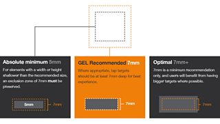
A number of device manufacturers give suggestions on target sizes, based on the average size of a fingertip when pressed onto a screen. Microsoft suggests a range from 5mm-9mm depending on the control (9mm is their safest size, for an action that requires more than two additional gestures to undo, for example). Android recommends a more generous target of 7-10mm. Apple suggests somewhere around 7mm. [1]
Ideally, we‚Äôd settle for a size in mm or even points (the traditional typographic point and not the Ã˝for targets to render on any screen regardless of its size. Unfortunately this is hard to achieve on the web.
Although , in practice it doesn't work, as devices rarely disclose their actual screen size or density to the browser.
Typographer Ã˝posed the challenge below to his Twitter followers in April last year, to render a banknote on a web page at actual physical size without knowing the user's device. Nick also listed some conditions that would have to be met in order for this to be possible, in . In short, it‚Äôs not happening anytime soon, and so far no one‚Äôs found a reliable workaround.

Nick highlights the difficulty of predicting rendered size of elements on the web
It became apparent that this process would be one of educated guesswork and not an exact science. Without a reliable way to detect or specify physical size, we’d have to do our best to predict the range at which our buttons, links and controls may render on a user’s screen.
Towards a baseline recommended size
Ã˝As there seemed to be a universally agreed minimum size of around 7mm, this felt like a good place to start. I had faith that there had been a fair amount of research on the part of Apple, Microsoft and Android to arrive at that size. We‚Äôre now referring to this as the ‚Äòphysical optimum‚Äô, and I‚Äôd hope as technology improves with time we‚Äôll be able to more accurately match this size.
GEL recommendations for physical sizes for a range of control types aims to be versatile
The question for now is: how does this relate specifically on the web (as opposed to native apps) when we’re catering for such a huge variety of devices? The approach I came up with was to work with average device resolutions to find the ‘sweet spot’.
I took a sample of some of the most popular devices on the market from Ã˝and collated an average baseline resolution for each group. This is worked out by combining the actual resolution with the device‚Äôs pixel density. For example, the baseline resolution of a device with 326ppi and a density of 200% would be 163ppi (iPhone retina display in this case).
We’re interested in baseline resolution as this is how a device identifies itself on the web, and what dictates scaling of elements such as buttons and typography with the use of media queries. Results are below:
Mobile: 154ppi
Tablet: 149ppi
Desktop: 115ppi
From these, I worked out the average size in rendered pixels of 5mm and 7mm for each group:
Mobile: 5mm = 30px, 7mm = 42px
Tablet: 5mm = 29px, 7mm = 41px
Desktop: 5mm = 23px, 7mm = 32px
This gave me an idea of the range at which an element may scale, and started to hint at sensible sizes for tap targets. But, there were some additional factors to consider:
- Suggested sizes should be even numbers, as many ‘tappable’ elements (e.g. buttons) have icons and labels that sit vertically centered within the space.
- The sample of desktop devices I took is not wholly representative of touch-enabled devices on the market. It’s hard to say exactly where this is going, but it’s likely in future we'll see much higher resolutions - closer to those of current tablet devices.
- These are averages only and the sample is by no means scientific.
- We’d need to recommend a safe minimum without going overboard. Going touch-first on desktop means making dramatic layout changes to existing content. If we play it too safe, these guidelines would become difficult for designers to implement.
Ã˝
Our ‘tap target’ size recommendation
Working with my colleague Alex Jones (Designer for GEL), we arrived at the sizes below after taking these factors into consideration, and settling for what we deemed a good compromise. As mobile and tablets were so close in resolution, we decided to group these together for ease of implementation.
Ideally, we would have had one single size to fit all screens, but in a responsive setting this is asking too much, and a greater degree of flexibility was necessary.
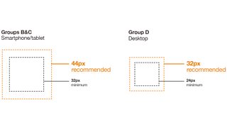
Device groups and their recommended size and a minimum size
Each device group specifies a ‘recommended’ size and a ‘minimum’ - when the minimum size is used an exclusion zone around the element must be preserved, to avoid accidental tap of an adjacent one.
The guidelines are now being used by the User Experience & Design team to inform upcoming ÷˜≤•¥Û–„ products, and they‚Äôll be available publicly on the new GEL website which is being planned now. Due to the rapidly changing nature of the web, it‚Äôs likely we‚Äôll revisit these recommendations in future to reflect the current state of devices and screen resolutions.
If you have any thoughts or questions on this research, it’d be great to hear from you, just leave a comment below!
Rory Pickering is aÃ˝User Experience Designer, ÷˜≤•¥Û–„ Future Media.
[1] Apple doesn’t actually specify a physical size. Their suggestion for iOS is 44pt, and on the premise that their guidelines are based on a first-gen iPhone – with a resolution of 163ppi – this works out at a physical rendered size of 7mm.