�������� iWonder: why did we start with a question?
Paul Crowley
Head of UXD
My name is Paul Crowley. Until recently, I headed up the User Experience & Design team on �������� Knowledge & Learning.
And this is a blog post about the development of the brand which was . It’s about how we took user centred designs, a strong editorial proposition and product leadership and created a brand.

Half-way through 2013, the editorial, product and technical work for the new K&L product had been in development for some time. We had a good idea of how things would work. We mostly understood the content ambitions. We knew that the entire proposition would be fully responsive, and would work on all devices. We knew that the heart of the proposition was our new, interactive guides.
The User Experience & Design team had been working on the user experience and design for some time. Knowing what we did, we’d already come a long way.
But, we were starting to struggle.
We knew what the new product did. We knew who we wanted to use it. But we couldn’t articulate what our audience should be saying about our new product when they experienced it. We didn’t know how it was supposed to make you feel.
A good deal of investigative and speculative work had already been done to bring concepts to life. But without a definitive personality or attitude for the new brand we couldn’t assess the effectiveness of it. We knew we still had a way to go, but we needed to agree on where we were going.
Then the name for the new product was finalised: iWonder.
With the name confirmed, some thought that the development of the brand and visual identity would be a straightforward thing to finalise. We already had detailed wireframes for the product. Surely we just needed to choose the best of our concepts from the previous exploration work and apply them to the new name, right?

Wrong. We knew we could do much better.
We’d already made progress on ideas for the visual identity with the agency Studio Output. However, without confidence in what the brand was, we’d generated lots of great concepts, but no consensus.
This was an important moment. When many expected us to charge ahead, we stopped. We questioned. We asked ‘what do we want the iWonder brand to be? What do we value? What is the essence of its personality? How will we make others feel when we get this right?
If we knew the answers to these questions, we’d know what ‘better’ meant in objective terms. We needed words that described the brand’s personality. Words that drove decisions. Words we could draw. Put simply, words that described the essence of the brand in a way that would align us all and take subjectivity out of the equation. If the true test of a brand is the way that the end user feels about their experience, these ‘words we could draw’ would be our blueprint. People relate to other people, so we needed to describe iWonder like we would a person. How would it behave, how would it appear, how would it make you feel? Getting this right wouldn’t just help with the visual design, it would help us set the tone for all our output – from the design of experiences right through to the tone of voice in our tweets and the way that we wrote our guides. We wouldn’t just have a visual identity, we’d have a rounded and descriptive personality that could be flexed to different contexts, and applied consistently to everything we do.
Brilliantly curious
With clarity on what was missing, I brought in Brand Strategy Consultants, Elmwood to help us shape the iWonder brand.
There was pressure to show progress, and we were short of time. This ‘reboot’ meant spending time on deliverables that appeared tangential to the ‘requirements’. In retrospect I’m delighted that I pushed for this.
Building on the original product vision of ‘keeping the UK curious’, we worked with Elmwood to develop a set of brand values (edited below for length) we could all agree on.
We wanted to describe iWonder like we would a person, so acting as the brand, we’d be:
- Hungry to discover more. We, like our users, are boundlessly curious, we have an inquisitive nature which is at the heart of what we do.
- Independent thinking. We support our audience, giving them confidence to determine their own conclusions in the quickest, most effective and entertaining way possible.
- Championing different perspectives. We see the world differently. There are many ways to look at a subject and we like to provoke. Itʼs great to be curious.
��
From here, we settled on words that described how iWonder should be perceived:
- Fascinating. Weʼre charismatic to be around so we want to entertain as well as stimulate and delight our users..
- Brave. We want people to have faith and trust in the information we give them so itʼs important for us to be bold in our service.
- Conversational. We donʼt want our audience to feel like theyʼre being lectured. We are friendly, accessible and above all great company.
��
Our impact. iWonder should make audiences feel:
- Intrigued. We want to stimulate our audienceʼs curiosity and create an experience that leaves them wanting to come back for more.
- Enlightened. We want our users to walk away from iWonder with a sense of wonderment, enriched and smarter than they were before. What great social currency.
- Captivated. We want to help our audience to enjoy an effortless, entertaining experience. Every aspect of our user engagement should be rewarding.
��
And finally, iWonder’s cause:
On a journey
We see the world differently. Weʼre endlessly curious, questioning and provocative.
iWonder has a streak of child like wonderment running through the centre of it. Every experience should be something new, surprising and delighting as though experienced for the first time.
There are many ways to look at a subject and we represent all views. We like to share, we like to provoke, we like to challenge normative thinking. Itʼs good to be curious - we take people on a ride which helps them feel at ease with asking questions.
Weʼre a brand which believes in actions too. Interactivity is at the heart of what we do. We are exciting, enlightening and vibrant. Weʼre about doing not just viewing. We are Brilliantly Curious.
Brilliantly Curious. This deceptively simple phrase became the pivotal and foundational element. It gave us the ‘words we could draw.’
Back to the drawing board
With the brand personality finalised, Tom Bradley and Bob Hamilton continued the work with Studio Output to finalise the user experience and visual design work. Starting with the iWonder logotype, they took time to review all of the previous research and concepts, and added in new ideas to create a number of concepts for a reboot.
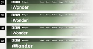
The front-runner
One of our success criteria for the logotype was that it contained something distinctive, recognisable and usable as a call-to-action when promoting content on other �������� sites; much like the play button inside the iPlayer marque.
The standout concept from the previous work integrated a question mark. This expressed the brand personality most clearly. After all a question is a direct expression of curiosity.

We liked this approach. The dot on the question mark had been plucked from the ‘o’ above – representing curiosity literally, with a slightly curious implementation. However, the typeface (Tondo) was too playful to be appropriate to the entire breadth and tone of iWonder content. There was the essence of an idea here, but that typeface needed to go.
We took the question mark approach and redrew it to better align with the aesthetic of our other online products. We started with Helvetica.

With a few modifications, we were pretty happy. We talked about whether the cut-away in the ‘W’ was one trick too many, but we liked the way it made the letter feel less dominant. It let the name flow, leading you to read it like the start of a question and not two separate sentences: ‘I wonder, not: I. Wonder’. It also added intricacy, or more specifically ‘curiosity’ to the overall marque. It wasn’t what you’d expect, yet it scanned well.
Still, we couldn’t help feeling that we needed a font with a little more personality. Referring again to the Elmwood work, Helvetica felt too clinical, too functional to support the fascinating, brave, conversational tone we were after.
Eventually we found a font named Sharp Sans (designed by Lucas Sharp) which hit the mark. It expressed the desired personality AND it sat well with the ��������’s GEL aesthetic.
With the decision made, we then commissioned some modifications to help the font sit even more firmly within the overall �������� GEL experience. The new font, Curious Sans, is now embedded inside all iWonder pages and used for titles. We’re the first �������� digital product to do this.
More than just a marque
Of course the brand is much more than a logotype. We needed to think about expressing the brand across the visual, editorial and functional aspects of the product.
We started with the core of the new product - the iWonder guide. We wanted to make sure the editorial proposition and the user experience around it was aligned to the brand personality. Visually and editorially, the experience needed to be ‘brilliantly curious.’
Hook, narrative, reflection
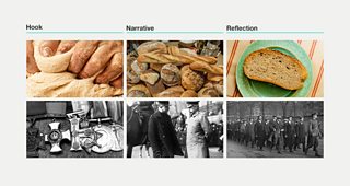
We started with the use of photography. Tying image selection into the fabric of the guides, different types of imagery were to be specifically selected for each stage of the experience.
Hook images are used for promotion, or at the start of the guide. They act as a means of picquing user curiosity. We want them to lean forwards and be seduced by the content. They are deliberately, provocatively selected and cropped so as to invite attention. What is this? What can’t I see? Show me more.
Narrative images then help to tell the overall story. They draw the user through the content and help explain or illustrate information, ideas and concepts.
Finally, Reflection images (literally) zoom out to show the bigger picture. They emphasise the new perspective that has been arrived at by working through a guide.
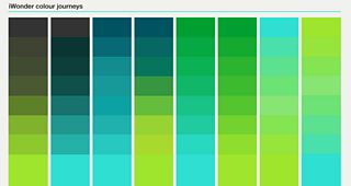
The colour journey
Colour was also an essential step in bringing our brand to life. In the absence of a brand personality, earlier uses of colour had veered towards a neutral, de-saturated palette. This was largely due to lack of confidence in what we wished to convey. This changed completely with the development of the brand personality. ‘Brilliantly curious’ didn’t just describe a cerebral quality, but a visceral, visual, and vibrant one. To support the brand, colour needed to be bright, bold, saturated. Distinctive and sometime clashing colours would embody the brand’s personality.
We also decided that we would use colour to convey visually, the learning journey at the heart of guides. As the user works through the guide, the accent colours change subtly from dark to light. The experience is literally enlightening.
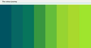
We didn’t choose just one gradient either. ‘Brilliantly curious’ suggested an explosion of colour. We created multiple, inter-changeable colourways. We could choose colours appropriate to the tone of the material. We could ensure that the iWonder homepage would be vibrant, bold, brilliant. Colour wasn’t to be tied to the iWonder logotype. In fact, this would be white – and deferential to the content. The colour in iWonder would be tied to the experience.
Steps on a journey
iWonder Guides are created as a series of distinct steps. Content can be consumed in a measured and productive way.
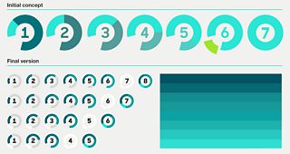
With this in mind, we developed a visual numerical system. It was derived from the iWonder marque to help the user understand where they are within an overarching journey. Because the final moment of reflection at the end of guide is an integrated and key part of the whole experience, the representation of the final step literally 'completes the circle’.
Putting it all together
With the design work mostly finalised, the final challenge was to take the visual system for the brand into the technical development of the Knowledge and Learning product. With the launch date ever closer, this meant balancing the brand specific elements with other editorial priorities that were being worked on.
We worked closely with development teams to agree upon the foundations of the brand that were vital, andthrough these discussions, further refined many of the visual design treatments.
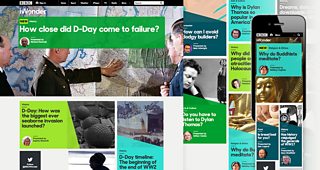
It’s an iterative process, and we still have plenty to work on. But we’re very pleased with the way our first few guides and the new iWonder homepage have brought the brand to life.
Looking back at the journey we’ve been on, I’m delighted with the outcome. I’m also delighted that like our brand, we took the opportunity to stop, to question.
The iWonder proposition is the result of the hard work of a great many �������� staff. The development of the iWonder brand itself was led by:
- Tom Bradley, Creative Director
- Bob Hamilton, Senior User Experience Designer
- Janine Horsfall and Steph Rowbottom, �������� Marketing and Audiences
- Ian Myatt, Head of Product for Knowledge & Learning
- Andy Pipes, Executive Product Manager for Knowledge & Learning
- . User Experience and Visual Design Consultants��
- . Brand Strategy Consultants
- And myself.
��
Paul Crowley is the Head of User Experience & Design for my��������, GEL, ��������page and Content Discovery.
